
The Challenge
Despite Fieldtype’s strong track record, their brand lacked cohesion and clarity. The original website felt too minimal and didn’t reflect their meticulous, logic-driven process. They needed a visual system that would communicate structure, focus, and a sense of quiet confidence — without feeling sterile.
The Solution
We crafted a brand identity rooted in logic and subtle emotion. The new design system uses grid-based layouts, monospaced rhythm, and a muted color palette with cobalt accents. Together, they express Fieldtype's balance between structure and softness.
Key Elements:
A custom logomark serves as the visual anchor: structured yet calm, it mirrors the team's precise but human approach.
We leveraged AI technology to create dynamic brand elements and optimize their visual system — making the design process more efficient and scalable.
The system guides the viewer's eye through logical patterns, allowing content to shine without distractions.

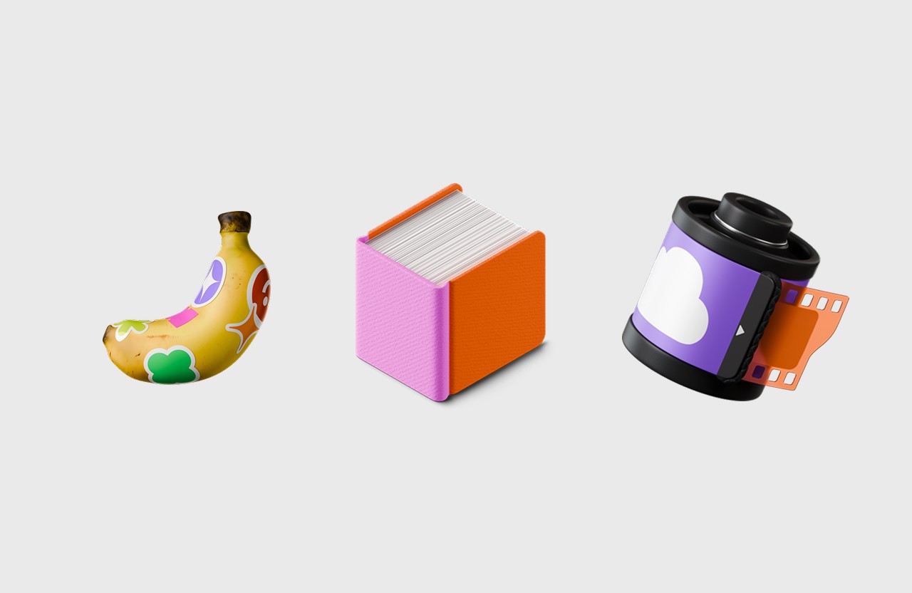
A custom logomark serves as the visual anchor
We leveraged AI technology to create dynamic brand elements

The system guides the viewer's eye through logical patterns
Outcome
With the new identity in place, Fieldtype launched a fully redesigned site and case study library. The refreshed brand has helped them attract higher-caliber projects, collaborate with leading European tech startups, and scale their storytelling with clarity and confidence.